Pinboards
Whenever I begin a decorating project, I pull together ideas so that I can see them all in front of me in one place. Usually, this is done in file folders or on a pinboard but since this is a blog, I will show you some of my current pins through collages below of images I've been collecting over the past month or so. One thing I do when I find images that I like in magazines and catalogs is I tear them out and file them away under a category like "bedroom" or "living room". I even have folders with non-room categories like simply "headboards" or "linens".
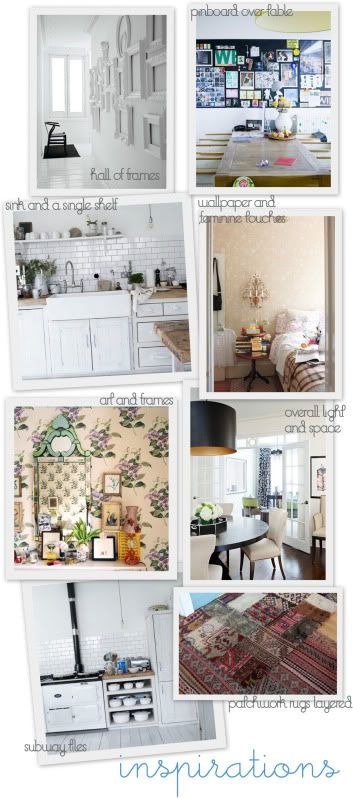
It's important to keep your ideas well organized so that you can pull from these folders when it is time for you to begin your decorating project. Another thing that I learned in design school was to always tag your tears so that you know WHAT you like in the image.
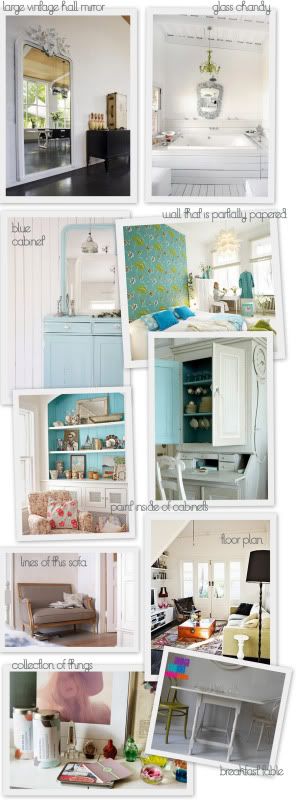
If you pull a picture of a living room from a magazine and file it under living rooms, that could be confusing when you pull the image in 6 months so I use post-its and tag the image with notes regarding exactly WHAT I liked in that particular image.
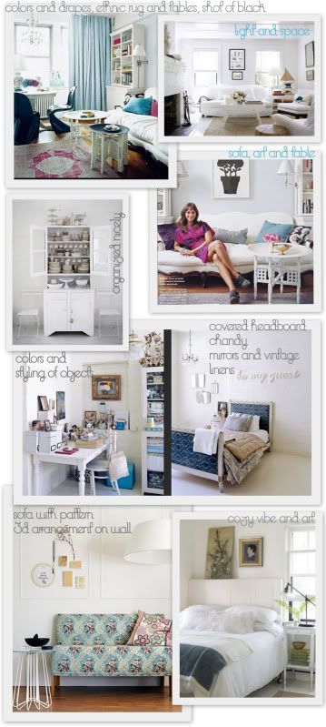
When I've worked with clients in the past I always asked them to do the same thing because it helps you to really pinpoint what you like about a particular room, it's less vague, and after tagging lots of tear sheets and building a collection of folders, you will definitely see common threads running through your style files that may provide you with a lot of insight regarding your personal style that you'd not noticed before.
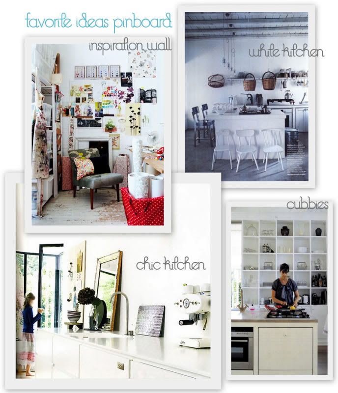
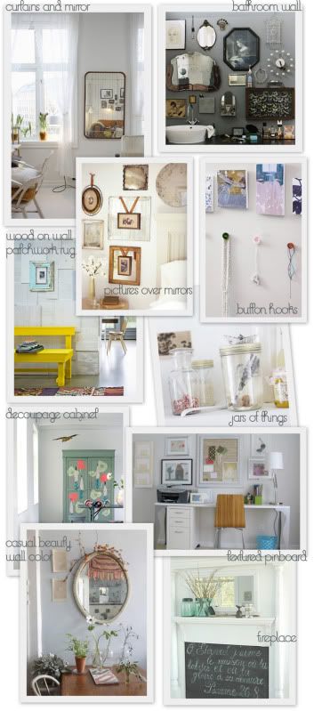
In this post are some examples of what I mean by pinpointing ideas, shown above in these photos. I identify exactly what I like. In folders, I usually go into even more detail but these arrangements above give you a starting point if you'd like to try something like it at home.
Also, do not write ON images but use post-it notes. Often what you like now, since our tastes evolve, may not be what you like when you pull the image in 6 months to examine it. At that time, you may not like your original notes and decide to pull the image from the folder and throw it away. This is an important exercise in editing and is vital to maintain current style files that reflect who you are and what you like today. You may also find upon reviewing an image in your folder that you still love it but for different reasons than before. If this is the case, you can simply remove the post-it note and add new thoughts on a fresh post-it. If you write directly on the image you have less flexibility and room to flesh out your thoughts.
These arrangements above are a few of my inspirations for my new flat. I am not sure which ones I will execute or not, but for now I'm building my image collection to see what sticks and what will not...
Enjoy!

It's important to keep your ideas well organized so that you can pull from these folders when it is time for you to begin your decorating project. Another thing that I learned in design school was to always tag your tears so that you know WHAT you like in the image.

If you pull a picture of a living room from a magazine and file it under living rooms, that could be confusing when you pull the image in 6 months so I use post-its and tag the image with notes regarding exactly WHAT I liked in that particular image.

When I've worked with clients in the past I always asked them to do the same thing because it helps you to really pinpoint what you like about a particular room, it's less vague, and after tagging lots of tear sheets and building a collection of folders, you will definitely see common threads running through your style files that may provide you with a lot of insight regarding your personal style that you'd not noticed before.

In this post are some examples of what I mean by pinpointing ideas, shown above in these photos. I identify exactly what I like. In folders, I usually go into even more detail but these arrangements above give you a starting point if you'd like to try something like it at home.

Also, do not write ON images but use post-it notes. Often what you like now, since our tastes evolve, may not be what you like when you pull the image in 6 months to examine it. At that time, you may not like your original notes and decide to pull the image from the folder and throw it away. This is an important exercise in editing and is vital to maintain current style files that reflect who you are and what you like today. You may also find upon reviewing an image in your folder that you still love it but for different reasons than before. If this is the case, you can simply remove the post-it note and add new thoughts on a fresh post-it. If you write directly on the image you have less flexibility and room to flesh out your thoughts.
These arrangements above are a few of my inspirations for my new flat. I am not sure which ones I will execute or not, but for now I'm building my image collection to see what sticks and what will not...
Enjoy!


Comments
I like your photo's and as always i'm very intrigued of how your new apartment will look like :D
Your new place is going to look fabulous. Love all your inspiration photos.
I am going to do this from now on. Thanks for the great tips, Holly!
To manage them, I use Picasa (google's software for picture organizing, editing and sharing) and I tag the pictures with the keywords I think that would be good to find them quickly.
I find it VERY helpful when the original websites watermarks or signs the picture, so I can identify the source - though it's not all that important, since I don't share them.
Just as a curiosity, my most common tags are: furniture I'd own, windows, ice hockey, nature inside, wall art, wine and lifestyle.
Another curiosity is that I'm a cataloging and reference librarian and I'm kind of used to apply keywords to items ;-)
Thanks for that fireplace picture - I'm definitely considering it for my living room - already got the frame for the fireplace!
Loads of greetings,
Fr.Mayer
Jodi that is a great suggestion . Pinterest looks really brilliant. Thanks
Since I've began blogging, I've sort of hit an 'inspiration/information overload'... not really an overload, but an abundance - that I've really been thinking about how I want to manage/save/sort/label/etc. This is merely online information, not including magazine material!
This is very inspiring and helpful. Thank you for sharing your process.
This post is a great help...I'm adding it to my Google Notebook:)
Although I don't comment each and every screenshot - some are pretty clear - I oftentimes go as far as jotting down the ideas the pic inspired me to, in particular, when the association in question involves a different material or technique.
PS: I'm from Belgium and I must say that I'm quite proud of the talent involving interior that we gained with you here in Europe ;) And sorry for my bad english.
From Bali With Love,
http://annaelizabethpoole.blogspot.com/
[/url]
[url=http://mises.org/Community/members/Propecia-Trusted-Online-62/default.aspx]best deal for propecia
[/url]
[url=http://mises.org/Community/members/Propecia-Online-Pharmacy-Online-2/default.aspx]generic propecia price comparison
[/url]
[url=http://mises.org/Community/members/Propecia-Pharmacy-Buy-1/default.aspx]finasteride propecia achat
[/url]