{living room + entry: color notes}
i was sketching the other day on an envelope and this is what resulted. sometimes answers can be found in the most random places. wait a moment and you'll see where i'm heading with this.
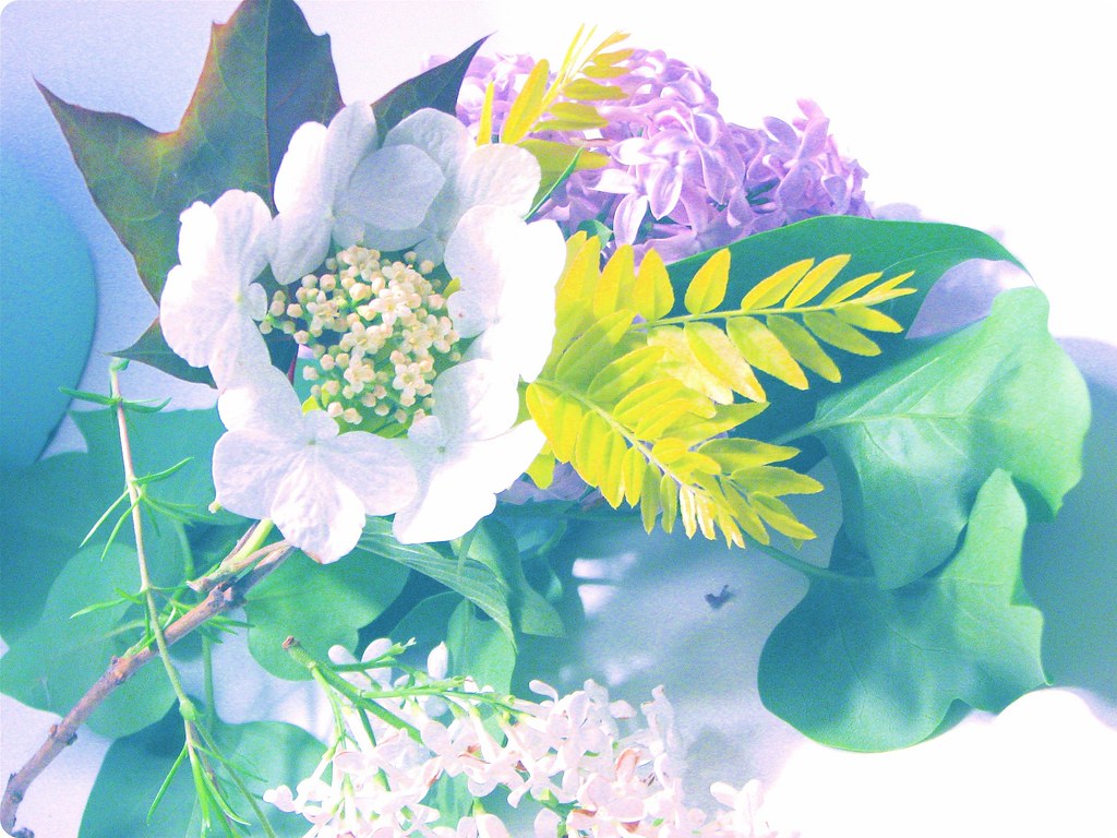
 after looking at it, instead of discarding my doodles as i often do, i photographed it and put it on flickr because i liked the pattern. the colors felt 'right' to me. this little doodle gave me the inspiration for a photograph I took a day later. this is a collection of pretty things picked from my backyard.
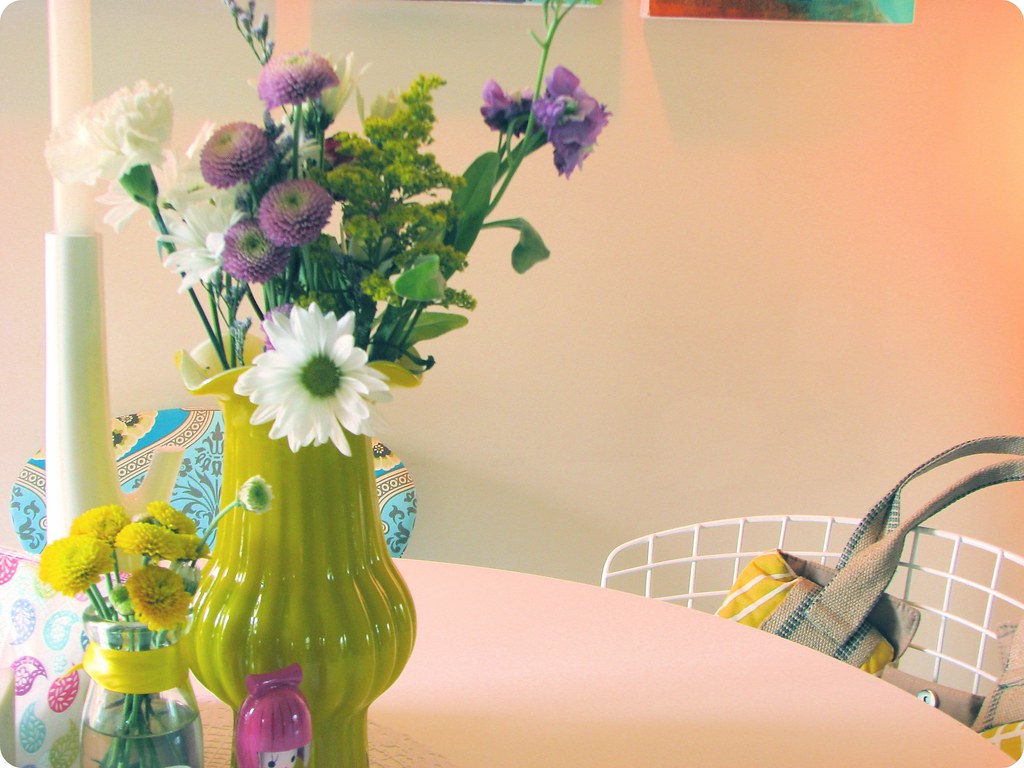
 then i sat down yesterday for a cup of tea and noticed the beautiful sunset. the soft glow filled and warmed the room. i quickly grabbed my camera and snapped a photo. again, notice the colors. see a pattern yet?
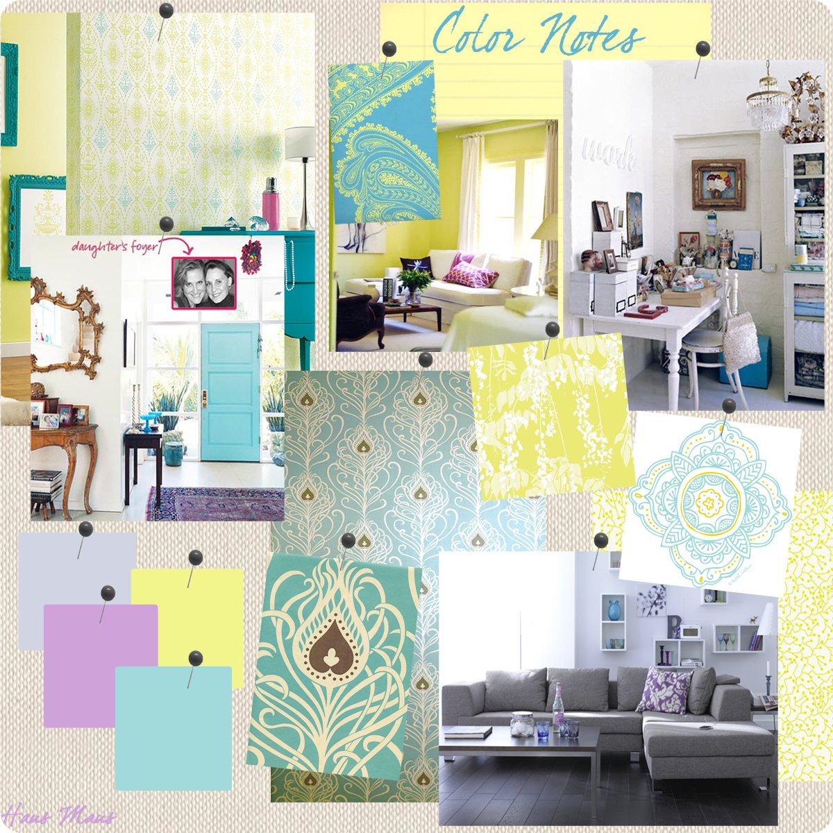
 then i started thinking about my new living room and bathroom, what colors i want to use, and so i started randomly pulling together images from my 'apt inspiration' folder on my desktop. as i dropped images onto a linen background i started laughing. out loud. at myself. the colors have been there all along. red-violet, yellow-green, blue-green... i don't think i can ignore this. :) a sign of sorts i believe. a path to follow.
as i look at my mood board i feel inspired but also a little frustrated. i mean hello holly. here i said i would do something different in my new space yet i'm using blues and yellows all over again just as in my current home. but i like blues and yellows. it's hard to break free from what one is naturally attracted to, but as i type this i think does one need to break free from what they love?
it's not like eating donuts. using the same colors over and over again certainly won't damage me. i read so often in decorating magazines that it's vital to experiment with other colors, to jazz things up with the color-of-the-moment. i don't need to experiment if i'm happy with using colors that inspire and comfort me. when it comes to my own space i continue to realize how completely unnecessary it is to follow popular trends just because my profession insists that i stay on top of the latest. if i love blues and yellows, then good for me.
if you use the colors you adore in your home, good for you too.
good for us all. :)
 (image by holly becker for haus maus)
 after looking at it, instead of discarding my doodles as i often do, i photographed it and put it on flickr because i liked the pattern. the colors felt 'right' to me. this little doodle gave me the inspiration for a photograph I took a day later. this is a collection of pretty things picked from my backyard.
 then i sat down yesterday for a cup of tea and noticed the beautiful sunset. the soft glow filled and warmed the room. i quickly grabbed my camera and snapped a photo. again, notice the colors. see a pattern yet?
 then i started thinking about my new living room and bathroom, what colors i want to use, and so i started randomly pulling together images from my 'apt inspiration' folder on my desktop. as i dropped images onto a linen background i started laughing. out loud. at myself. the colors have been there all along. red-violet, yellow-green, blue-green... i don't think i can ignore this. :) a sign of sorts i believe. a path to follow.
as i look at my mood board i feel inspired but also a little frustrated. i mean hello holly. here i said i would do something different in my new space yet i'm using blues and yellows all over again just as in my current home. but i like blues and yellows. it's hard to break free from what one is naturally attracted to, but as i type this i think does one need to break free from what they love?
it's not like eating donuts. using the same colors over and over again certainly won't damage me. i read so often in decorating magazines that it's vital to experiment with other colors, to jazz things up with the color-of-the-moment. i don't need to experiment if i'm happy with using colors that inspire and comfort me. when it comes to my own space i continue to realize how completely unnecessary it is to follow popular trends just because my profession insists that i stay on top of the latest. if i love blues and yellows, then good for me.
if you use the colors you adore in your home, good for you too.
good for us all. :)
 (image by holly becker for haus maus)



Comments
Do what you want! I'm going to live vicariously through your yellow kitchen b/c a green or yellow kitchen is my dream, but probably won't happen for a long time!
http://www.flickr.com/photos/megmcg/462445210/in/set-72157594537208023/
good luck!
Kim
You are so darling; yes go with what you love; only mix it up if you feel you need to stretch for you own sake. I am stretching in my new design studio in the conference room, still twinging from the stretch, but hoping that it will come together once all is warmed with furnishings, artwork, textiles, etc; can you say melon. :) Love your board, and love paisley.
support to you on this journey, jana
xo
Melissa
And they remind me of one of my favorite posts of yours on decor8 -- the store you featured earlier this year called Rice (I bookmarked it!). Although your palette is a tad softer, they seem to have a lot of blues, yellows, and purples that will be in your new space. Love your mood board.
Kylie
I just discovered a collage of Etsy stuff on Flickr - lots of blue/yellow/green that you might like! The username of the guy who made it is Brazan Design; link to the collage is
http://www.flickr.com/photos/25128631@N03/2533363944/
Like everybody else who've commented says: of course one should stick to what feels right! The basic colours in my apartment are always the same, but the opportunity to play with other colours is still available through accessories.
I'm looking forward to following your new house project!
Best wishes,
T
besides i love to see your inspiration board!
and the mood board and flowers in those colors are certainly guiding you to that,they are gorgeous shades together.
it was beautiful reading on flickr about your german connection, thankyou for sharing it. i don't have many ways to meet guys yet so your story of how love found you, really helped me keep believing that time will come for me,the internet is a wonderful connector of like minded/hearted souls isnt it
Kathryn xox
And I think we all have certain preferences in colors that keep coming back...